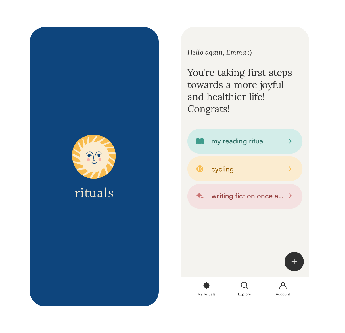
Rituals Wellness App
How might we help people turn wellness into a sustainable, personalized journey of joy and balance?
CLIENT
The National Wellness Institute
Project created as a design challenge at Ironhack Bootcamp
PROJECT TIMEFRAME
August 2022 / ±60 h
TEAM
Jasmin Arredondo and Kasia Kaczmarek
SCOPE
User Research
UX Design
UI Design
User Testing
Visual Design
Prototyping
The Problem
The National Wellness Institute is a forward-thinking organization dedicated to helping people lead healthier, more fulfilling lives. The institute recognized the immense potential of technology to transform how people approach wellness. They envisioned a tool that goes beyond tracking habits to inspire personalized, meaningful self-care practices rooted in emotional well-being.
Our task was to design an MVP app that focuses on mental well-being, supports users in reducing stress, enhances relaxation, and cultivates sustainable habits.
the opportunity
This project presented a unique chance to bridge the gap between wellness theory and practice. The National Wellness Institute’s mission to foster intentional, fulfilling choices aligned perfectly with the demand for more accessible and adaptable self-care solutions. By centering the design on behavioral modification and emotional balance, we aimed to humanize healthcare and empower users to create rituals that bring both joy and balance to their lives.
the Approach
Our approach combined user-centered research with an emphasis on simplicity and flexibility. We conducted surveys, interviews, and competitive analyses to identify gaps in existing wellness apps and understand users' needs. These insights guided the design of an app that prioritizes:
Personalization: Custom rituals tailored to individual values and goals.
Guidance: Reflective onboarding to help users connect with their “why.”
Motivation: Tools for tracking progress and celebrating small wins.
target device
iOS mobile app
the context
The mHealth (mobile health) app market is booming, with a valuation of USD 37.48 billion in 2024 and a projected annual growth rate of 14.9%, expected to reach USD 86.37 billion by 2030 (source). This growth reflects an increasing demand for digital health solutions fueled by greater smartphone penetration, rising health awareness, and supportive government initiatives. However, despite their proliferation, many apps fail to address the deeper challenge of sustaining healthy habits. Users often struggle to maintain routines due to rigid designs, lack of personalization, and insufficient support for long-term behavioral change.
14.9%
$86.4B
Expected U.S. mHealth app market value in 2030
Projected anual growth from 2024 to 2030
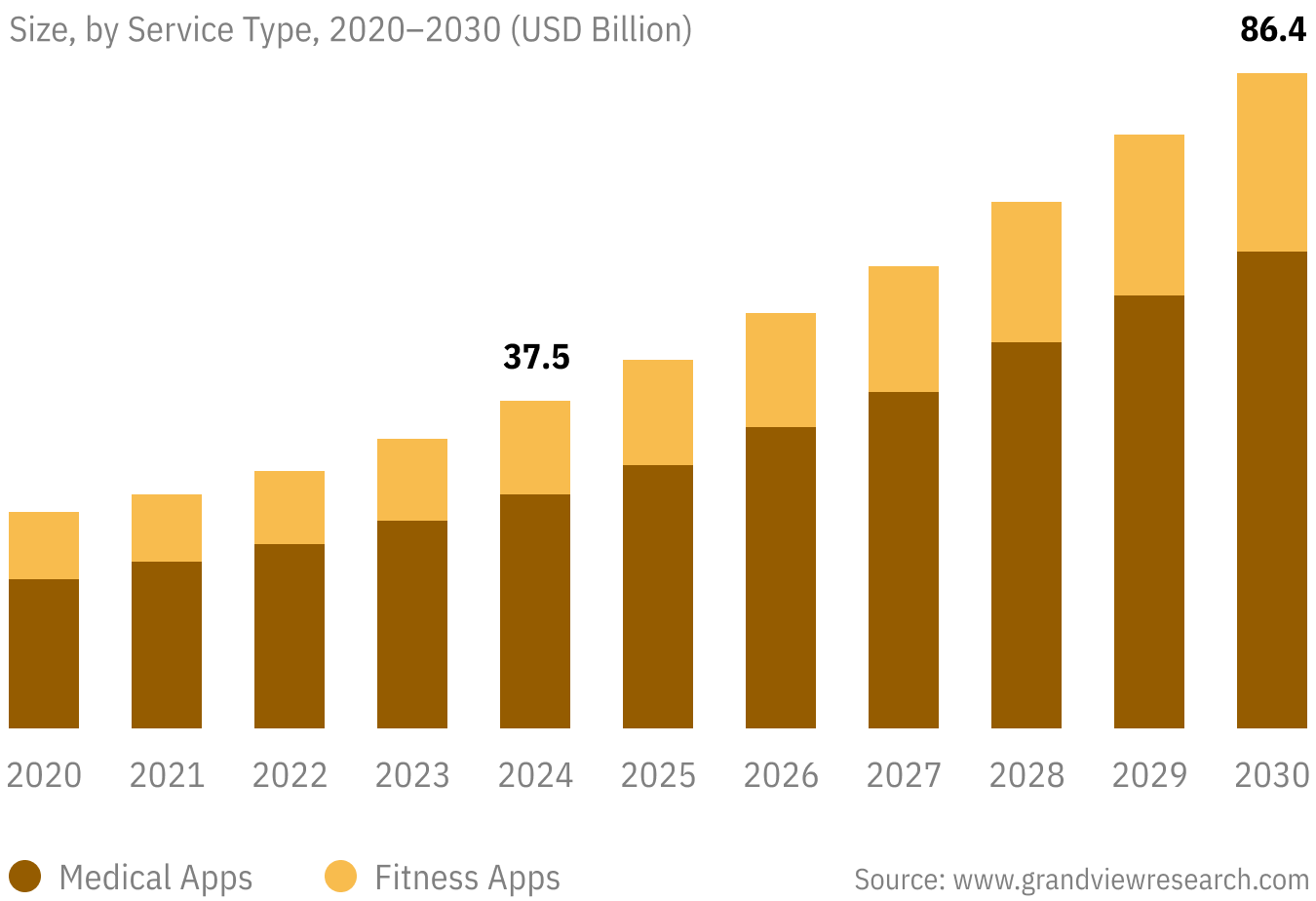
U.S. mHealth Apps Market
Understanding the user: research approach
To ensure our app was truly user-centered, we conducted a structured research process that combined quantitative insights (broad trends and statistics) with qualitative deep dives (personal experiences and motivations). Our goal was to understand not just what users struggle with when it comes to self-care, but why these struggles persist and how technology could better support long-term habit formation.
Competitive analysis
Finding the gaps in existing wellness apps
To identify market gaps, we analyzed wellness apps like Fabulous, BetterMe, Owaves, and Grid Diary. Each had strengths, but also notable limitations—some focused too heavily on habit tracking, while others lacked personalization.
brand comparison
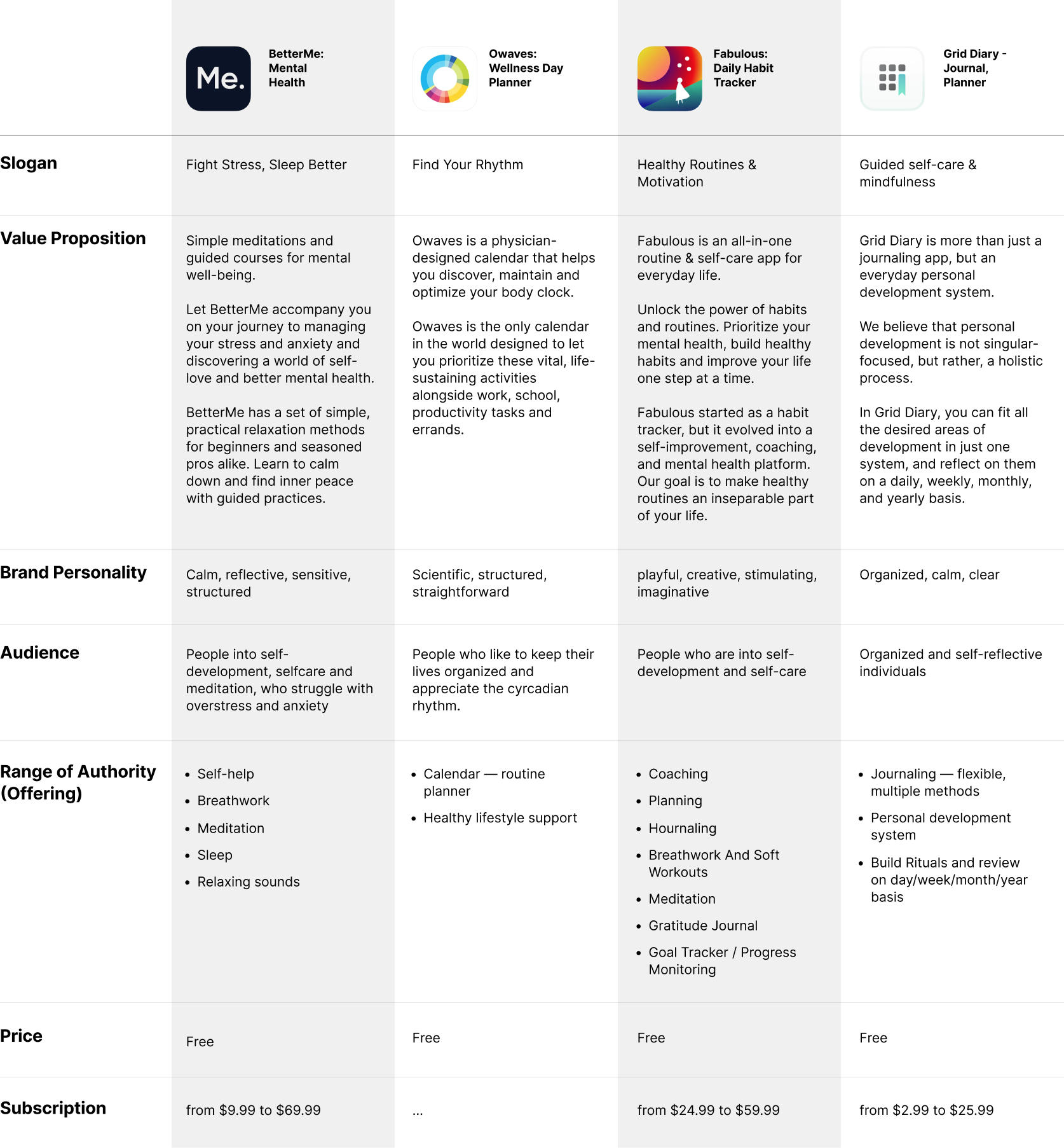
These insights revealed an opportunity—an app that blends structure with flexibility, allowing users to personalize their experience while receiving gentle guidance and encouragement.
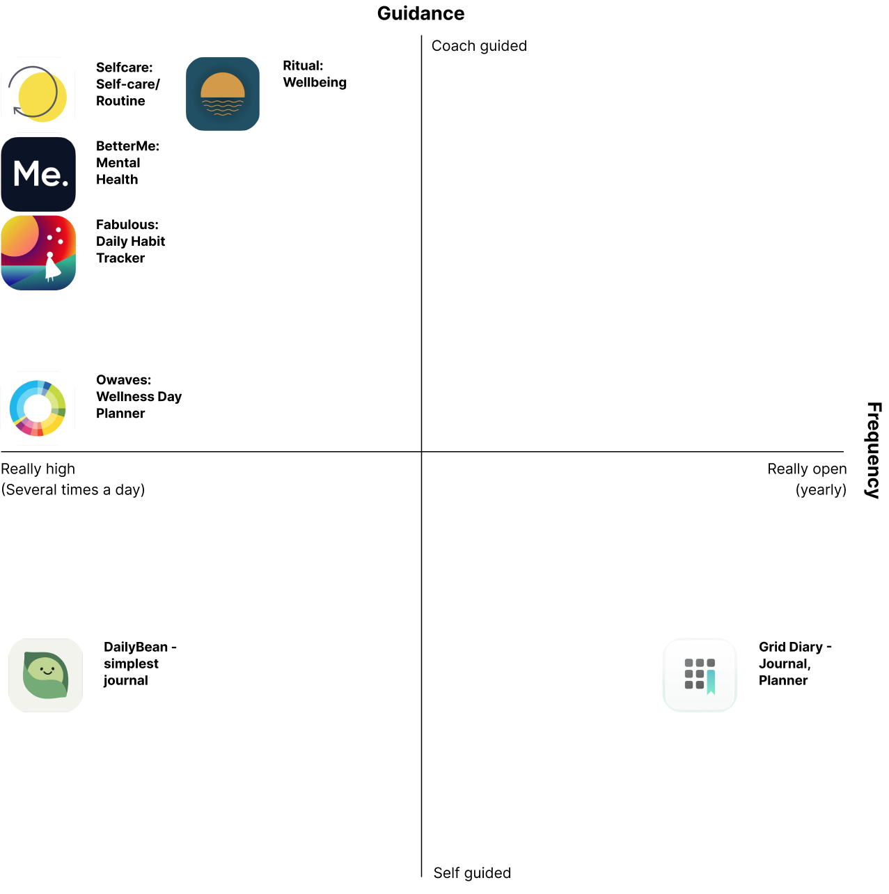
Market Positioning Map
Expert interviews
Leveraging professional insights to understand habit formation
To deepen our understanding, we consulted two life coaches who specialize in habit formation and personal development. Their insights provided a crucial perspective on how we build and sustain healthy behaviors.
Key insights
purpose and joy in maintaining new routines,
emphasized how stress and lack of self-discipline often derail efforts.

149
User Research
Survey Responses
7
User Interviews

Quantitative Research
The survey gave us a greater understanding and knowledge of our audience, their habits, preferences, and information that we then used when going into qualitative research.
Users Interviews
Video interviews with seven users helped us understand their joint pains and motivations—for looking to falsify our general assumptions.
Interviews
Key research findings
Research insights, organized in an affinity diagram, brought structure to our data and uncovered trends:
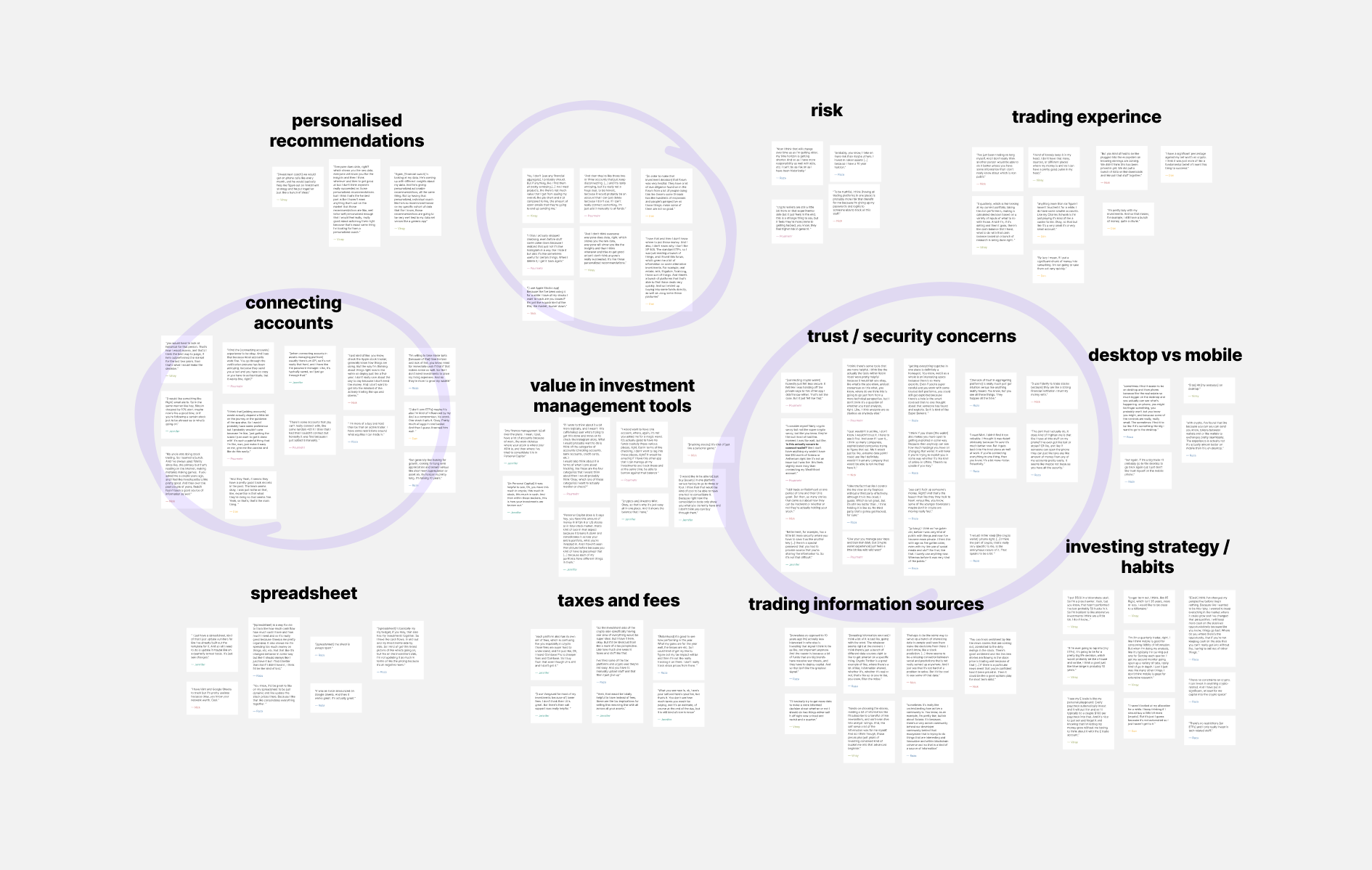
Trust is key when it comes to connecting accounts.
People have an increasing number of assets or accounts to connect — usually 4+.
They prioritize security.
They expect no less than a seamless, best-in-class experience.
User Persona & User Journey
The insights from research served as a base for a User Persona and their Journey Map.
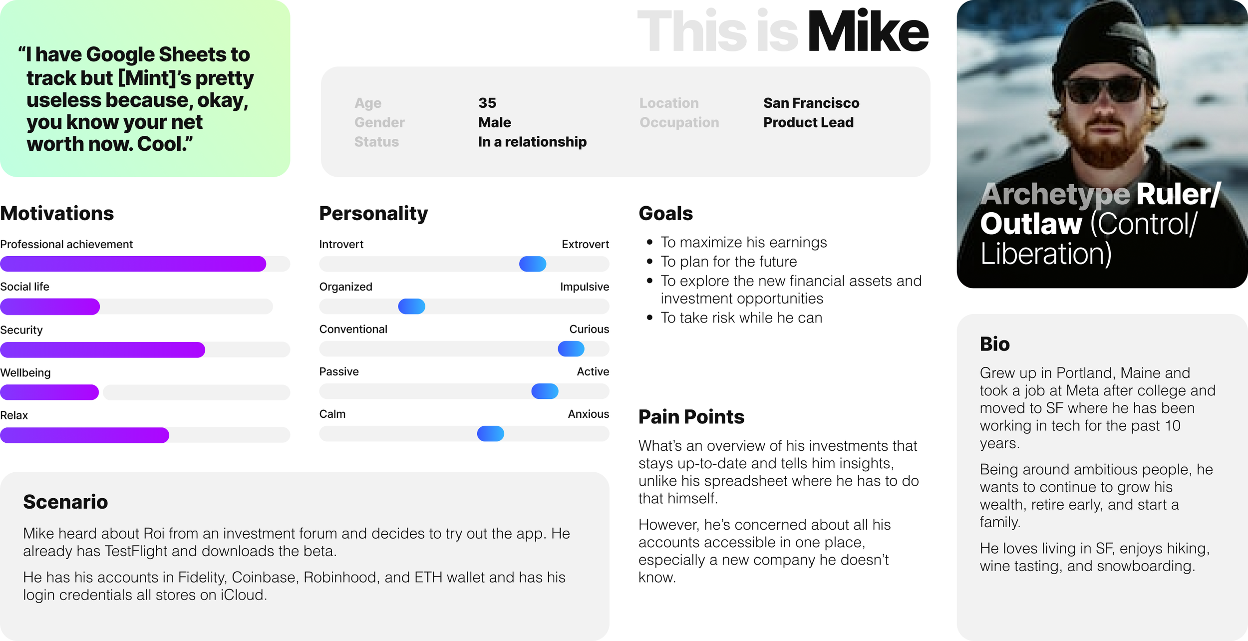
Mike is a product manager who isn’t taking full advantage of the opportunities to maximize his investments. He needs a way to access all his assets quickly and conveniently from a mobile device.
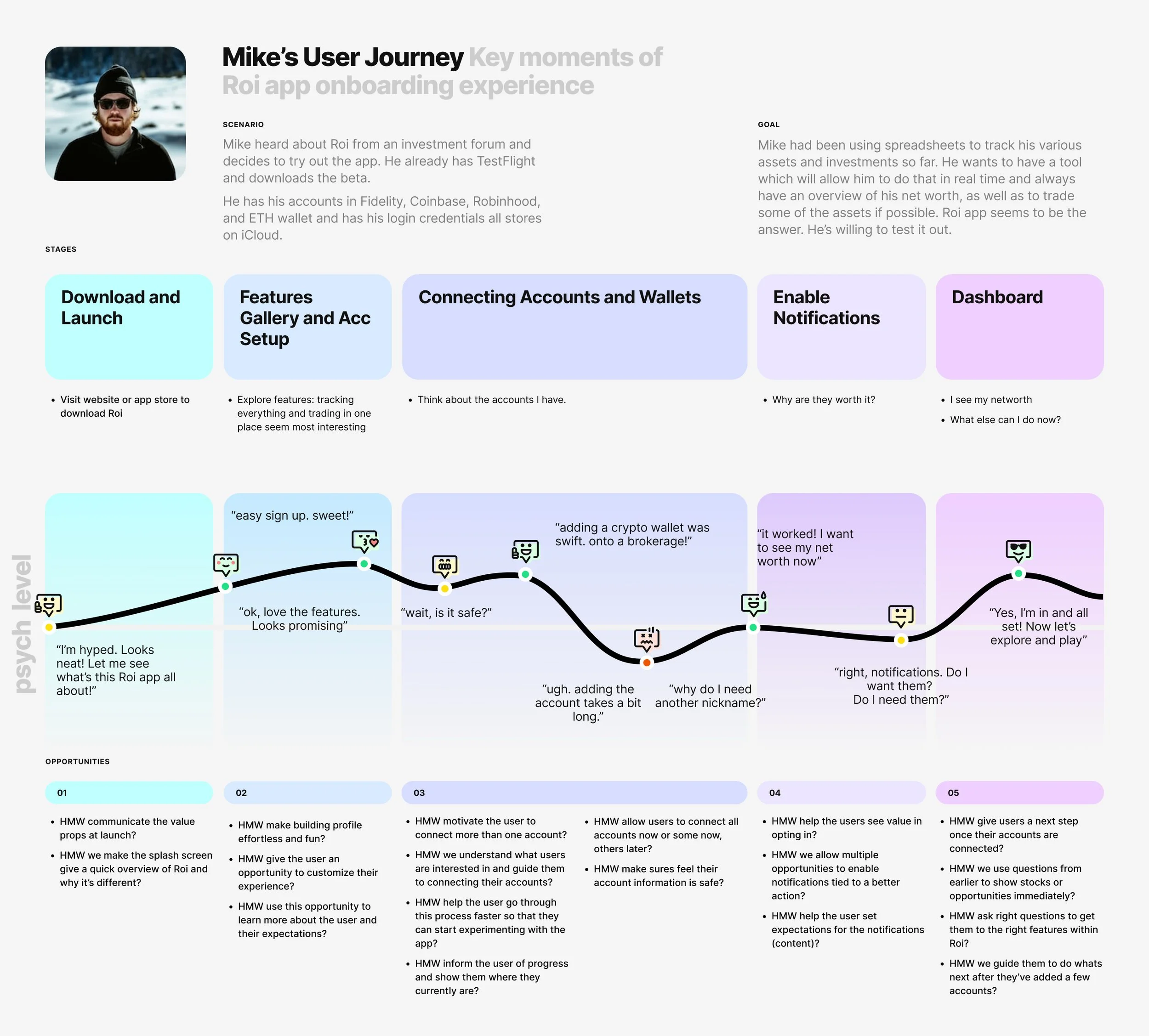
The user’s journey map allowed us to understand the onboarding experience of a portfolio management app.
Mike’s steps, obstacles, successes, and the accompanying feelings create a foundation for designing a delightful onboarding.
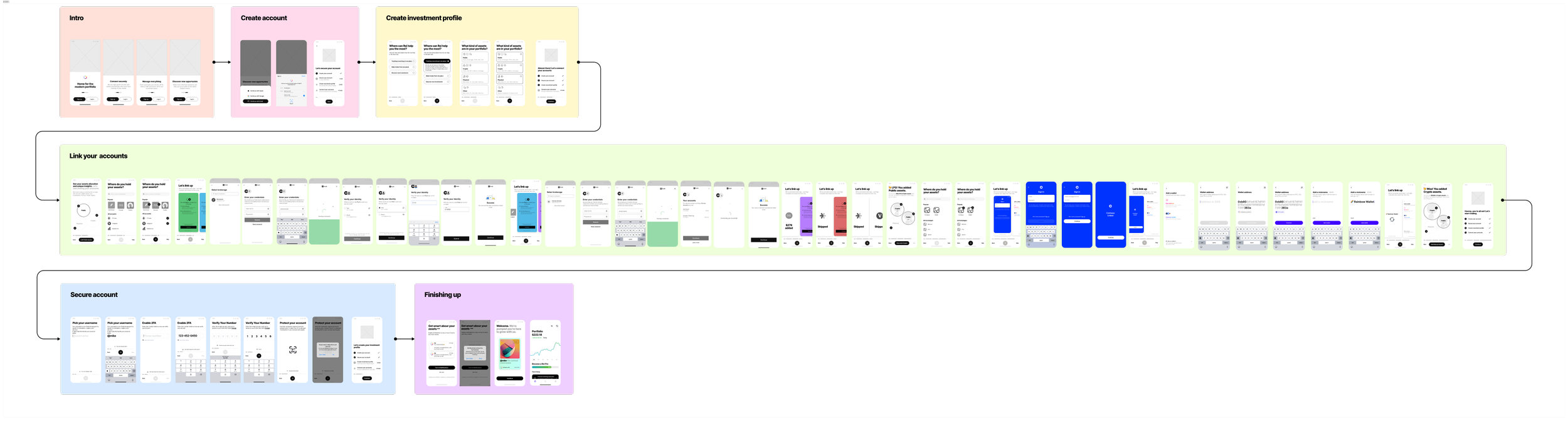
The Solution
We combined all the best practices and the current user flow and broke it into sections. This helped us lay the foundation and determine our building blocks.
The linking account part of Roi’s onboarding flow is the key to its success. This is what we’ll focus on.
↓
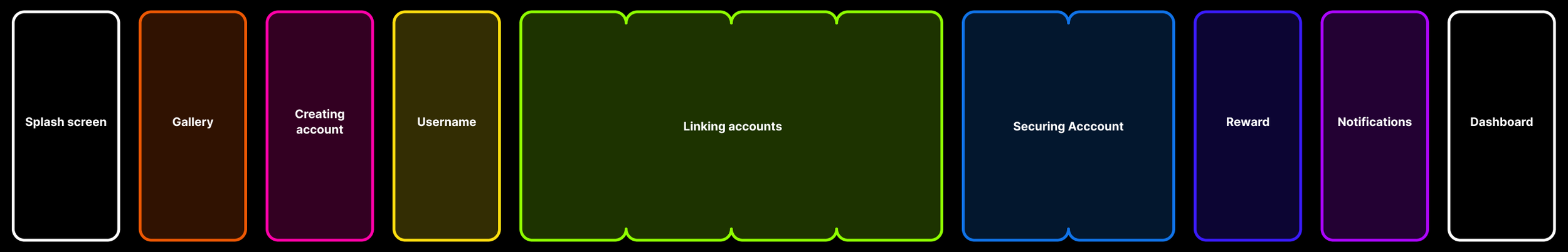
New user flow
the solution
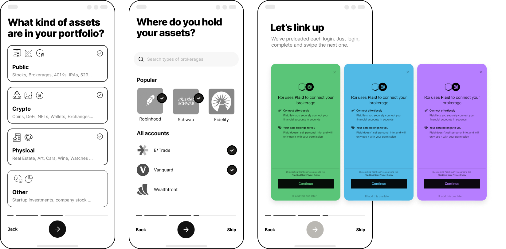
02. Innovative
Then we went to how about we make it even easier and open all the logins in one view like you would an app switch on iOS and try to swipe through and log in one at a time, making it a fun thing to do.
01.1
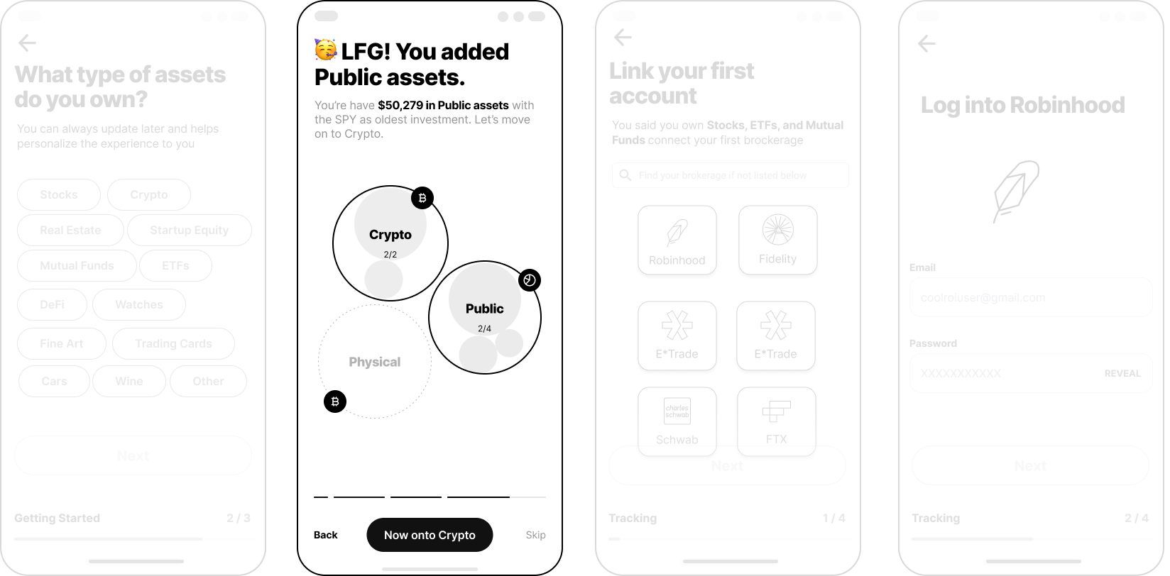
We can help them visualize it as a tree or a map and see if they can add stuff.
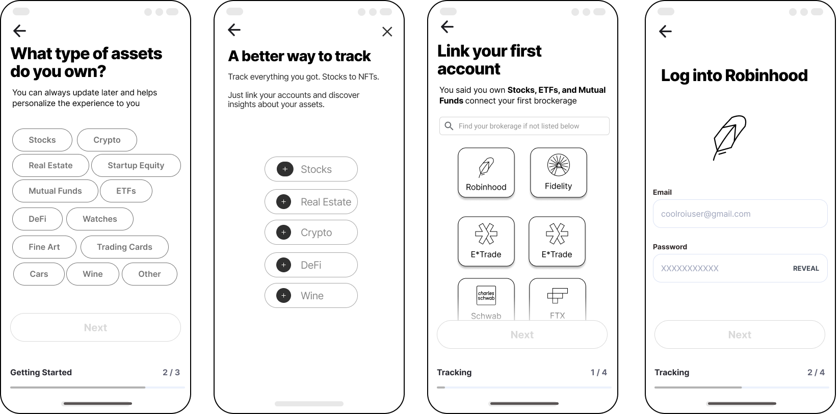
01. Logical
How about the user has all the options laid out, and they will be able to tap and add accounts?
We found ourselves at a crossroads.
Do we do this fun app-switching model?
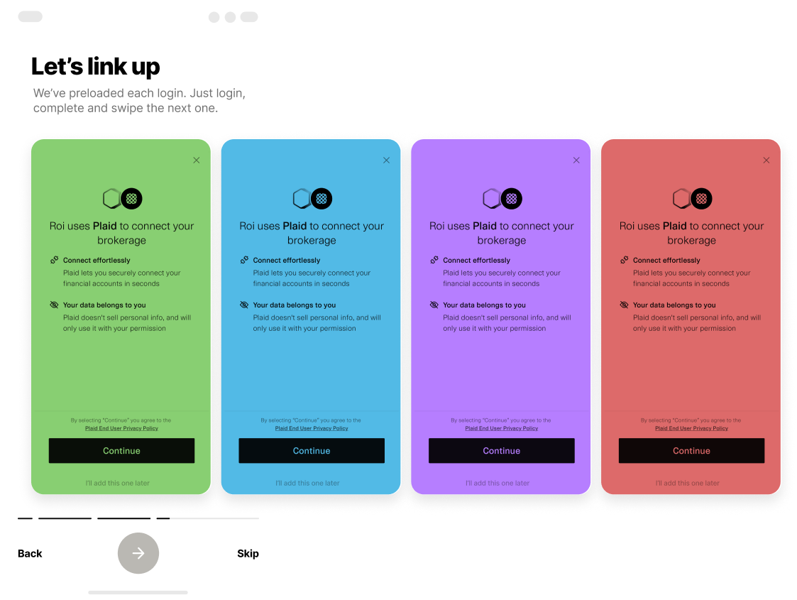
Or do we do what’s practical and logical?
We iterated on the innovative model, tested the wireframe prototype with users, and…
it didn’t work :(
Technical limitations posed a major challenge to an exciting idea. Roi’s API partner Plaid had many restrictions, such as requiring the user to view the login screen each time. This made it difficult to complete the project in four weeks.
So we had to bail on this exciting idea and build another, more practical solution.
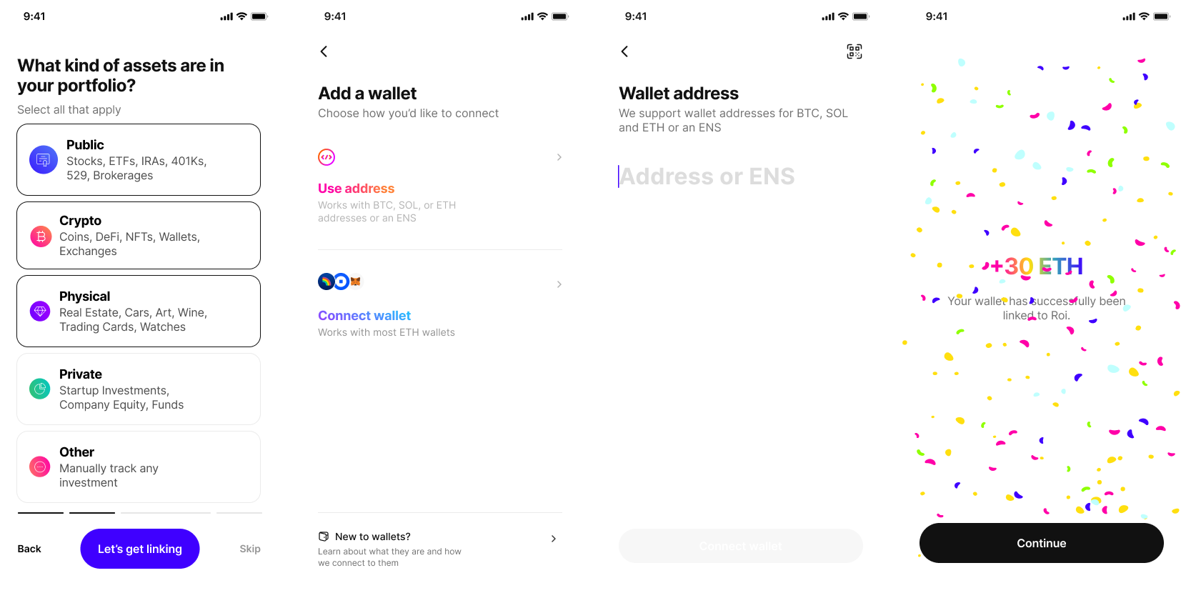
This is the Prototype