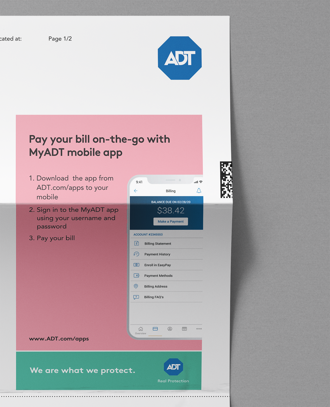
ADT
Reducing customer friction and inbound calls stemming from confusion around monthly bills by 25% for the home and business security leader.
CREDITS
Kasia Kaczmarek:
Information Design
Copywriting
Graphic Design
Experience Design
Blake Godkin et al.:
Research
ADT
Dec 2019/Feb 2020
Who is ADT?
ADT is an American company that provides home and business electronic security, fire protection, and other related alarm monitoring services throughout the US.
The challenge
We were tasked to take a deep dive into the billing experience and develop ways to make bills more user-friendly, and based on those findings, to design a new solution for ADT bills that’ll make the user’s life easier.
the result
After introducing the improved statement, ADT saw their inbound calls drop by 25%.
Billing Customer Feedback Analysis
Results from Available Knowledge from client’s feedback
Sentiment around Billing, Payments, and Account Management is dominantly negative—49%. Peak volumes occur around the summer months.
Sentiments Summary for Billing

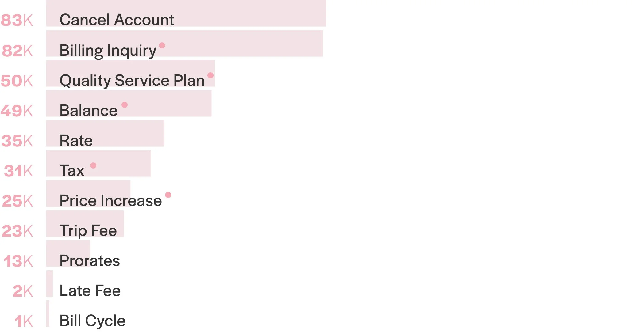
Top Reasons For Calls for Billing

Top Categories

Numbers of Billing Calls per Category (yearly)
Usability Tests
The comprehension of customer pain points and expectations informed a more effective redesign of the bills.
The research was conducted with call-center agents to learn how they were managing customers’ billing questions and the customers to learn about any obstacles they faced in receiving and understanding their bills.
How customers ranked parts of the bill by importance
1. Payment due date
2. Total amount due
3. Summary of charges
4. Previous Balance
5. Payments and Adjustments
6. Account Number
7. Account Activity Details
8. Service Address*
9. Important Messages**
10. Payment Coupon***
11. Home Security Messages**
12. Billing Information Change Form
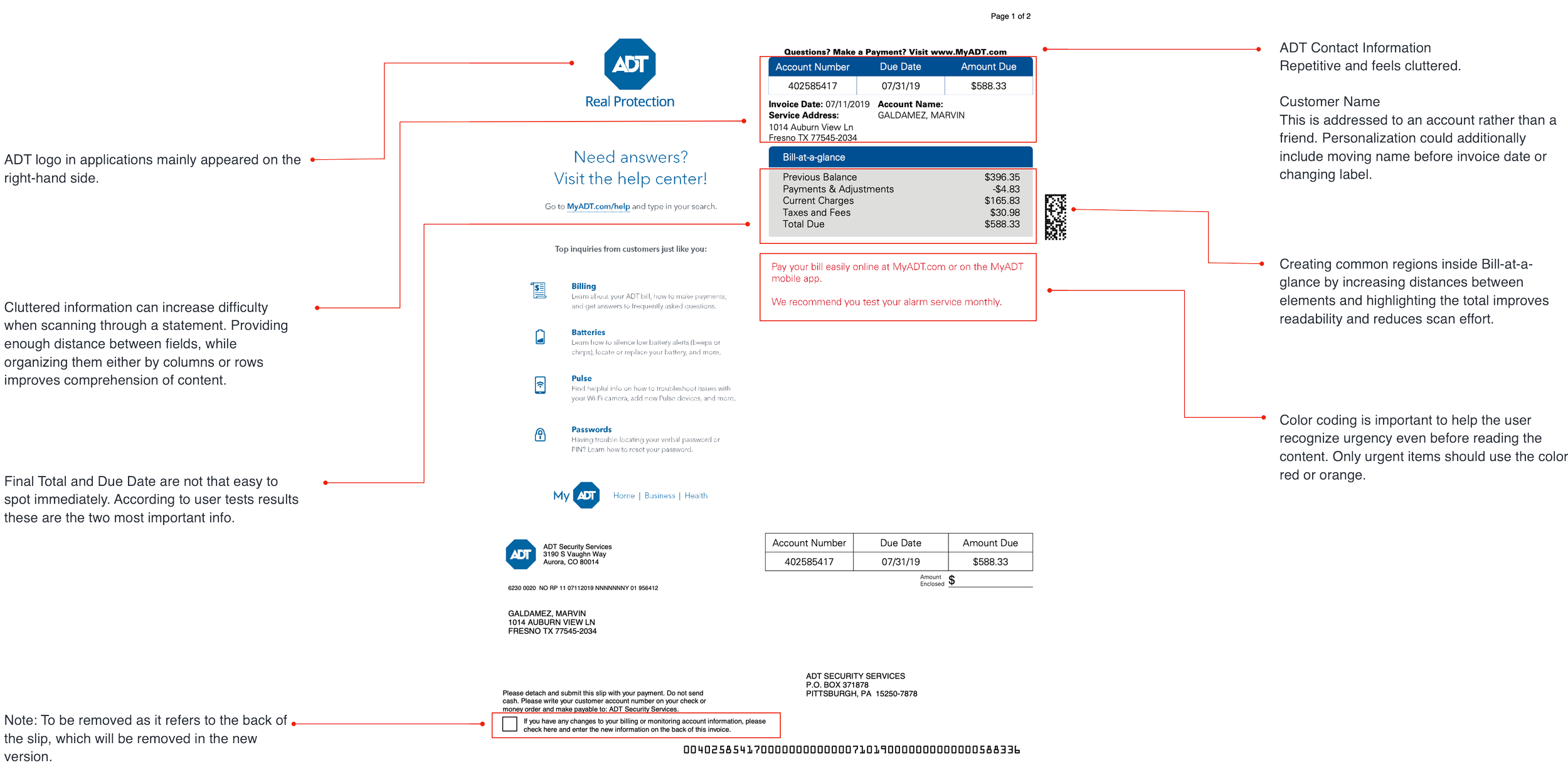
* The term “service address” is confusing because it’s not the way the users would describe their home address
** A bill should not be a notifications note; this type of information shouldn’t be in a bill.
*** Confusion about what is a payment coupon. Is it a discount?
Usability Tests Results
Customers’ concerns and behavior in the face of a problem:
The users value consistency.
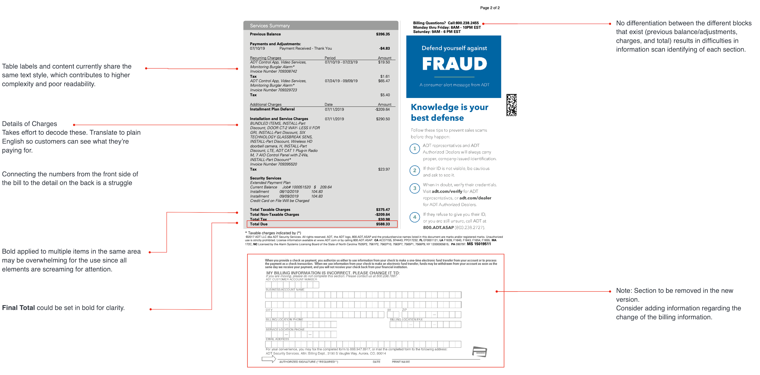
They found fees (for example, taxes) not being separated from the charges as confusing.
When they encountered parts of the bill that were not clear, many of them automatically preferred to call rather than try to solve it themselves or keep looking for an explanation.
1. Past experiences (with telecoms and cable companies) cause some users to monitor the changes to the bill very closely.
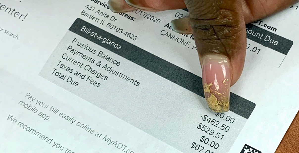
When the “Bill-at-a-glance” section is confusing, the users try to look to the “Services Summary” on the back for answers, but connecting the numbers from the front side to the detail on the back is a struggle.
Negative numbers cause confusion
2. Summary and detail don’t pair well.
Some concluded that they would call before they attempted to flip over the bill
Others took issue with having to flip the bill to find key information.
3. They don’t flip the bill.
The terminology used to describe installation and services left several confused.
Three people looked closely at the detail provided on the install-related bill and admitted to being confused by the terms being used.
4. Too much technical language.
We ran a preliminary heuristics evaluation to assess the usability of the current design, provide feedback, and improve user experience — all in a cost-effective way.
Preliminary heuristics
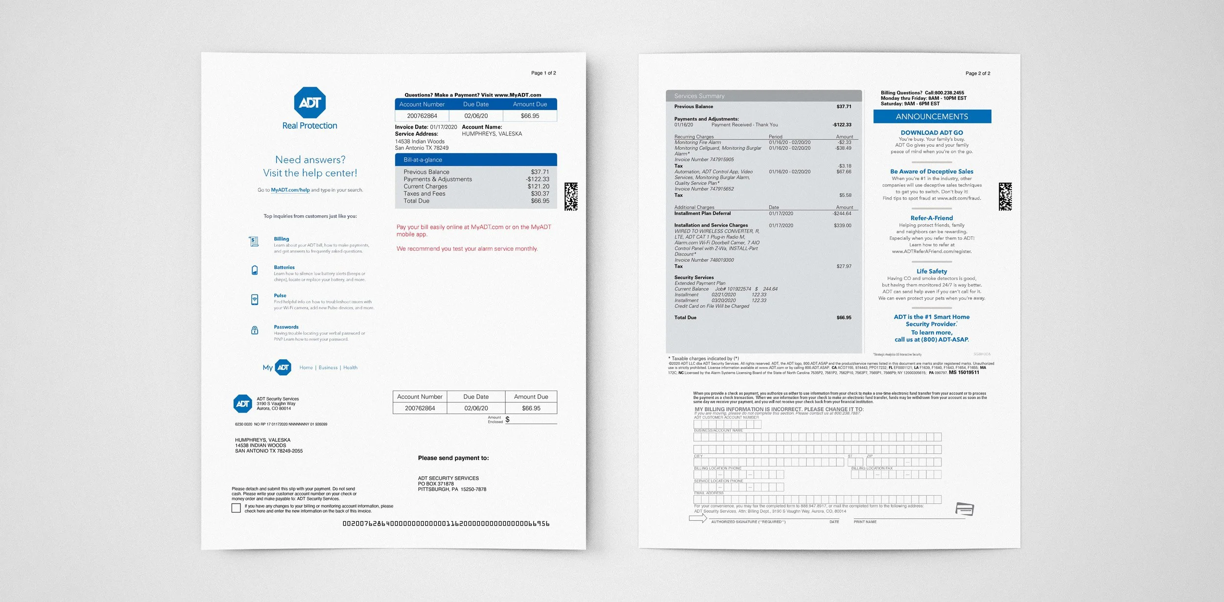
Front of the Bill
Back of the Bill
Summary of findings
Visibility of System Status
Ensuring customers can instantly comprehend their statements builds trust and enables them to respond swiftly to relevant items.
Utilizing visual cues to differentiate status improves visibility.
Consistency & Standards
Customers engage with brands across various platforms, and their experience is impacted by visual design, content, tone, and functionality. Establishing continuity among channels enhances customer experience and strengthens the brand image.
We have identified discrepancies in both online and printed materials.
Aesthetic & Design
Our brain’s capacity is limited, so an aesthetically minimalistic design is vital to help it quickly process info.
We analyzed several items to simplify customer analysis in the documentation and avoid clutter and a lack of hierarchy.
Defined design problems
As a customer, in what ways might I…
always know how much I owe ADT when reviewing my bill?
do I always know when my next payment is due?
be informed of changes to my bill in a way that I can understand?
understand the math on my bill in real-world terms?
be encouraged to actually read my bill?
In what ways might my bill use more human language?
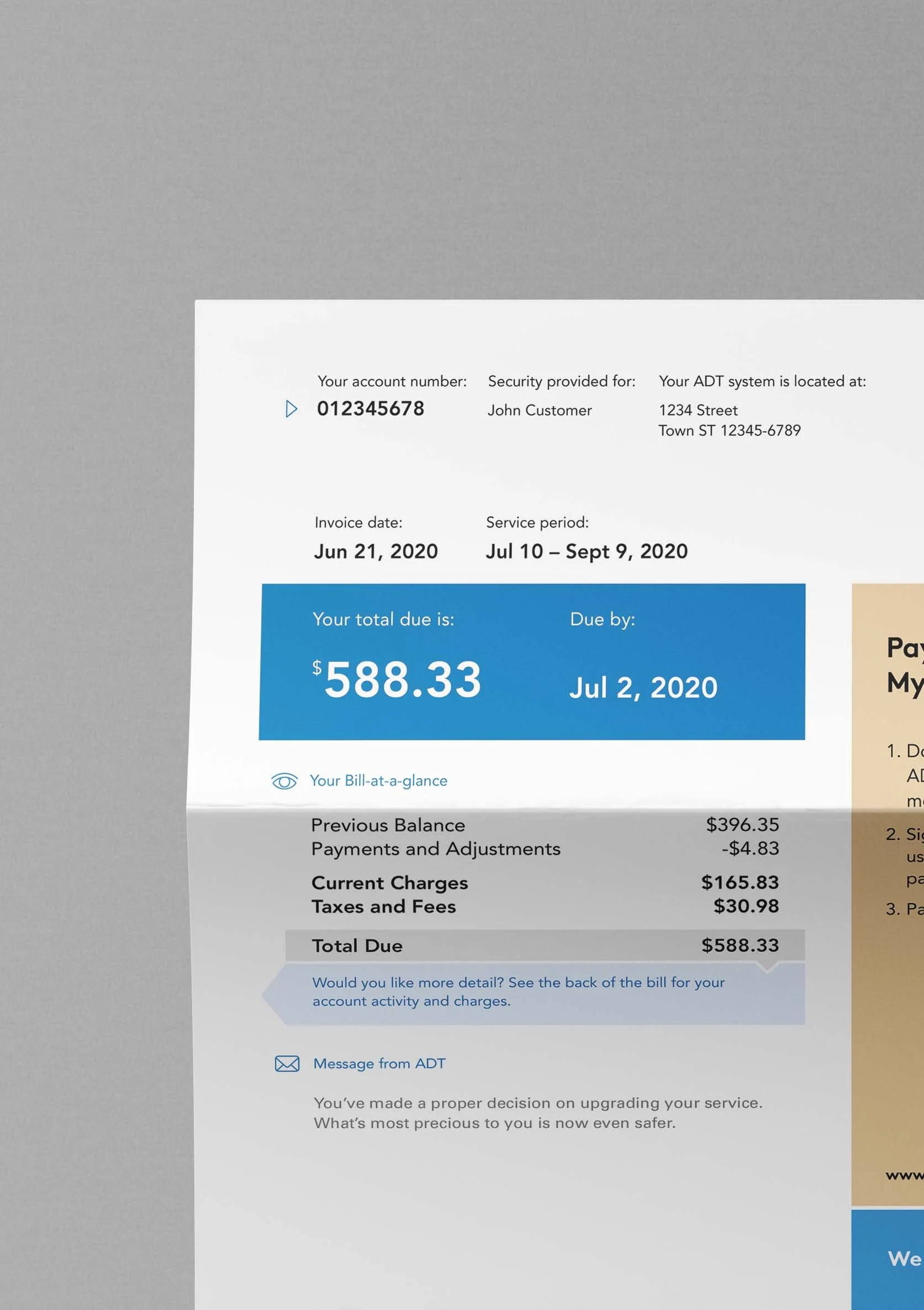
the new design
The redesign focused on decluttering the bill’s content and enhancing readability to improve the user experience. The objective was to promote trust and make understanding easier by using a consistent approach and friendly language for billing details and status information.
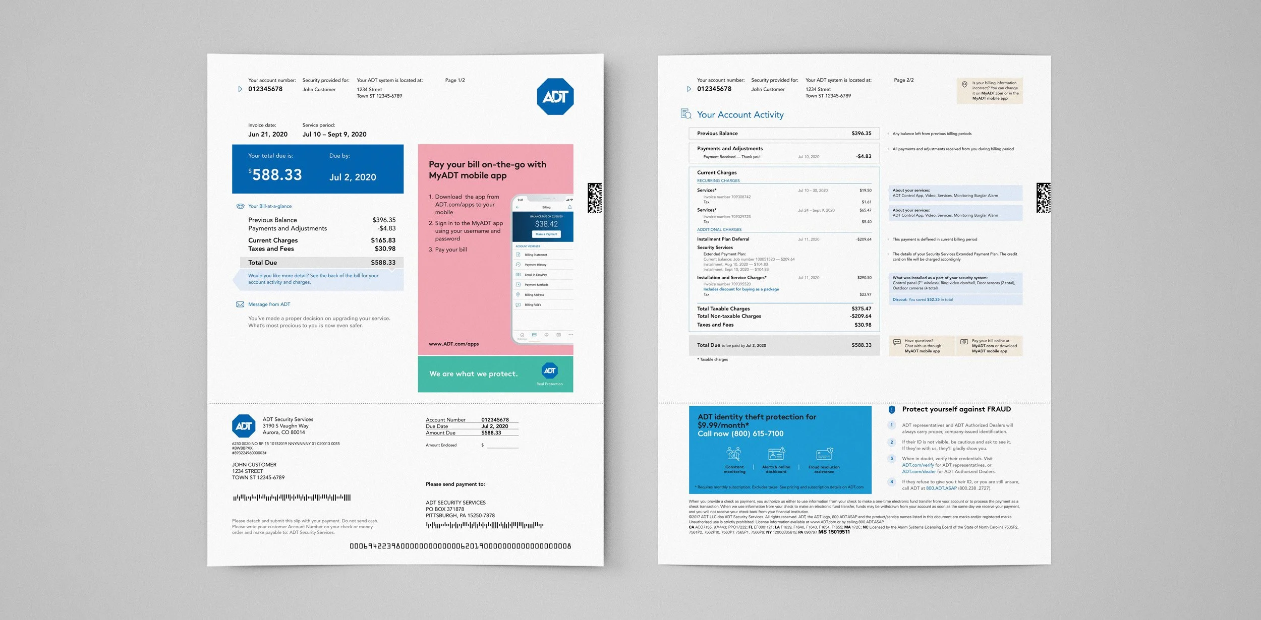
The deliberate use of typography, color, and composition draws the customer’s attention and makes critical information easier to distinguish on the page.
How much and when?
Expanded bill items and explanatory tooltips
With clear, consistent language, the bill copy explains the charges in an accessible manner that clarifies the customer’s billing status while reinforcing ADT’s brand.
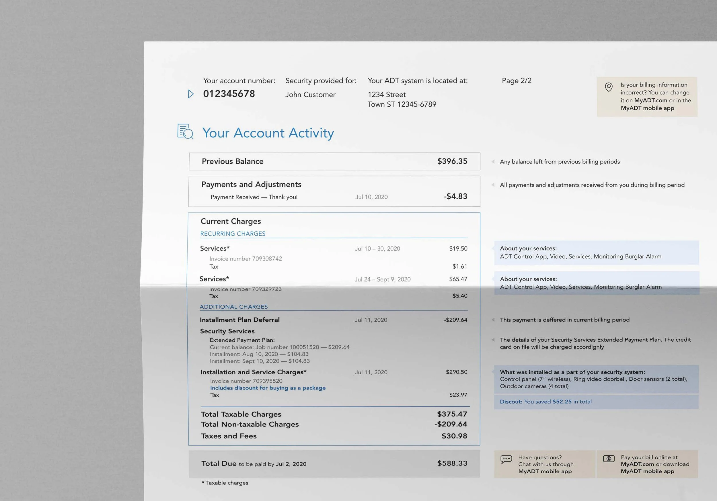
Space for targeted up- and cross-selling messaging
Promoting new services or cross-selling, and obtaining visual language consistent with the digital experience of the brand.
the result
After introducing the improved statement, ADT saw their inbound calls drop by 25%.
