
Roi App
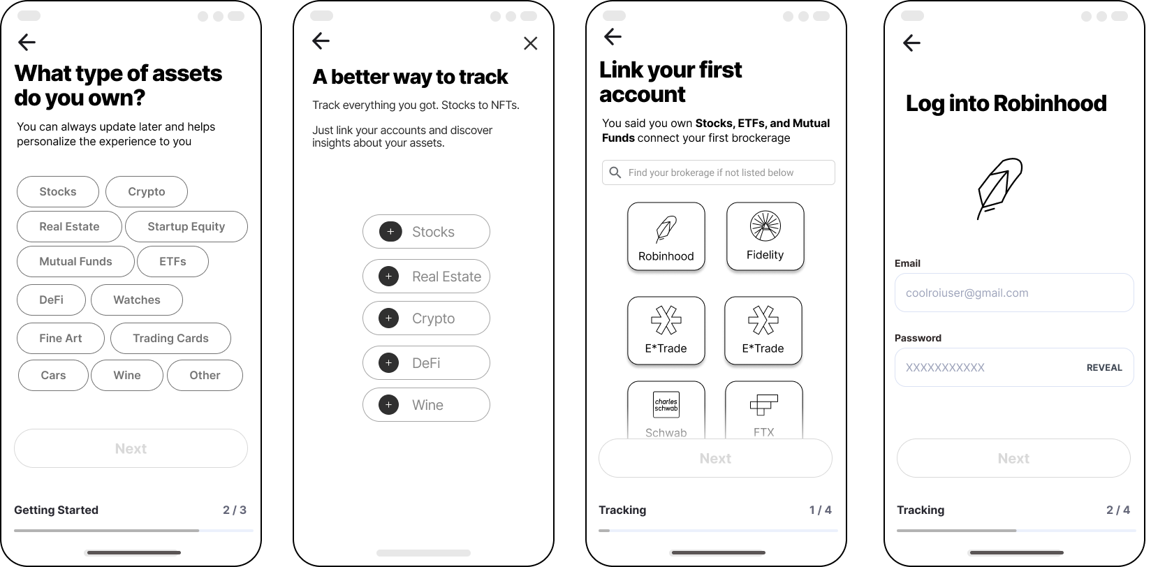
How to smoothly onboard a modern investor into an all-in-one portfolio manager app?
Roi
Oct/Nov 2022
6 weeks
Team
Aman Manik, Kasia Kaczmarek
Scope
User Research
UX Design
UI Design
Prototype
The project was done as a final design challenge at Ironhack Bootcamp.
The Problem
Roi is an investment portfolio manager app (at the time, in the beta phase—about to be released). Their existing onboarding was simple and utility-driven but lacked the potential to make a strong first impression with the users and help them get the most out of the service.
We took on the challenge of enhancing the onboarding experience.
Approach
The project consisted of analyzing the existing onboarding, understanding the stakeholders’ requirements and technical limitations, researching the existing and potential users, and, based on the above, creating a new solution and presenting it as a prototype.
Target Device
iOS mobile app
About the Business

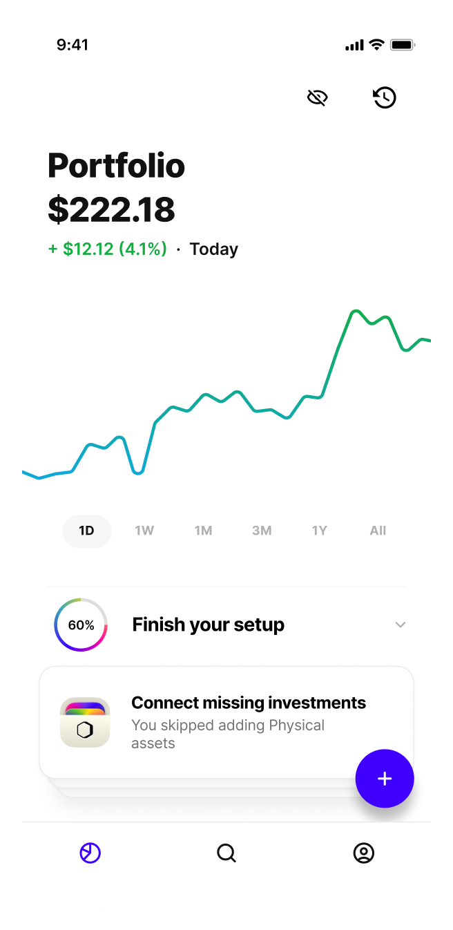
Roi* is an all-in-one portfolio manager app for a modern investor.
With Roi, users can track their net worth and make trades across existing accounts — with support for stocks, ETFs, cash, real estate, watches & more. They can also easily set up and manage alerts and discover new opportunities.
All in one app.
*Roi, not R.O.I., although the name, in fact, is a play on return on investment.
From the Stakeholders
Business Goals
Learn about the Users
Build a more compelling profile of the users: where they are coming from, what they need and want, what they're looking for, or what drives them.
Connect Accounts
Help the users create a complete financial picture by connecting trading accounts, bank accounts, and other assets.
Delight
Give the users a smooth and entertaining experience while onboarding, resulting in a positive impression of the app and a clear sense of provided value.
KIPs
Increase activation rate
61% → 75%
Increase the average number of connected accounts
2.15 → 3
Increase notification opt-in rate from 57%
Maintain a completion rate of 95%
Secondary Research
What’s a great onboarding experience like?
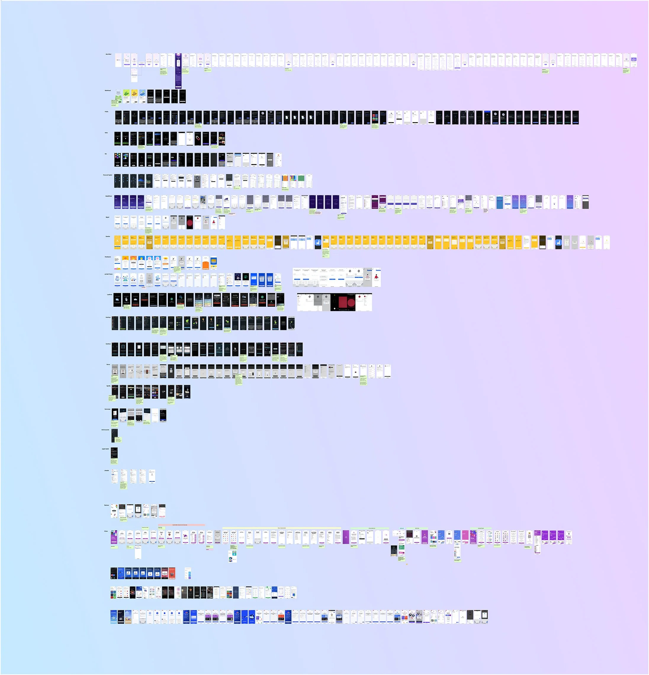
We analyzed 25+ onboarding and device/account connecting flows — from fintech to brands like Apple or Sonos, as well as read various research articles on best practices and common mistakes, and this is what we learned.
Onboarding best practices
Control and Safety
Gain user trust, so they feel confident in building the complete financial picture — connecting the accounts.
Show Progress and Reward
It’s ok to ask more questions to learn about the users as long as they orient with progress and wayfinding, and are provided with some rewards along the way.
Convenience
Keep the signup uncomplicated and allow the users to access it instantly
Fast to Value
Let the users move into the app faster.

149
User Research
Survey Responses
7
User Interviews

Quantitative Research
The survey gave us a greater understanding and knowledge of our audience, their habits, preferences, and information that we then used when going into qualitative research.

Users Interviews
Video interviews with seven users helped us understand their joint pains and motivations—for looking to falsify our general assumptions.
Interviews
Key research findings
Research insights, organized in an affinity diagram, brought structure to our data and uncovered trends:
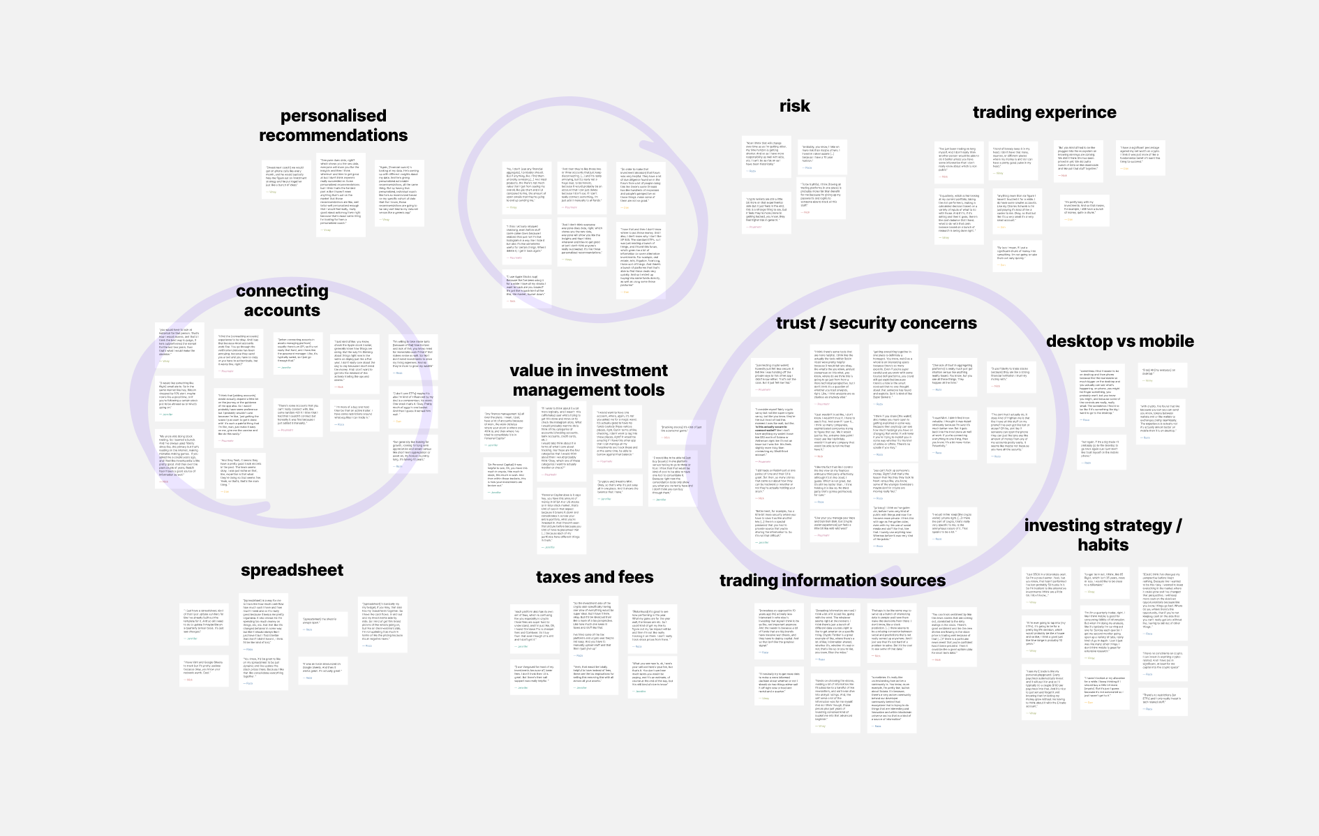
Trust is key when it comes to connecting accounts.
People have an increasing number of assets or accounts to connect — usually 4+.
They prioritize security.
They expect no less than a seamless, best-in-class experience.
User Persona & User Journey
The insights from research served as a base for a User Persona and their Journey Map.
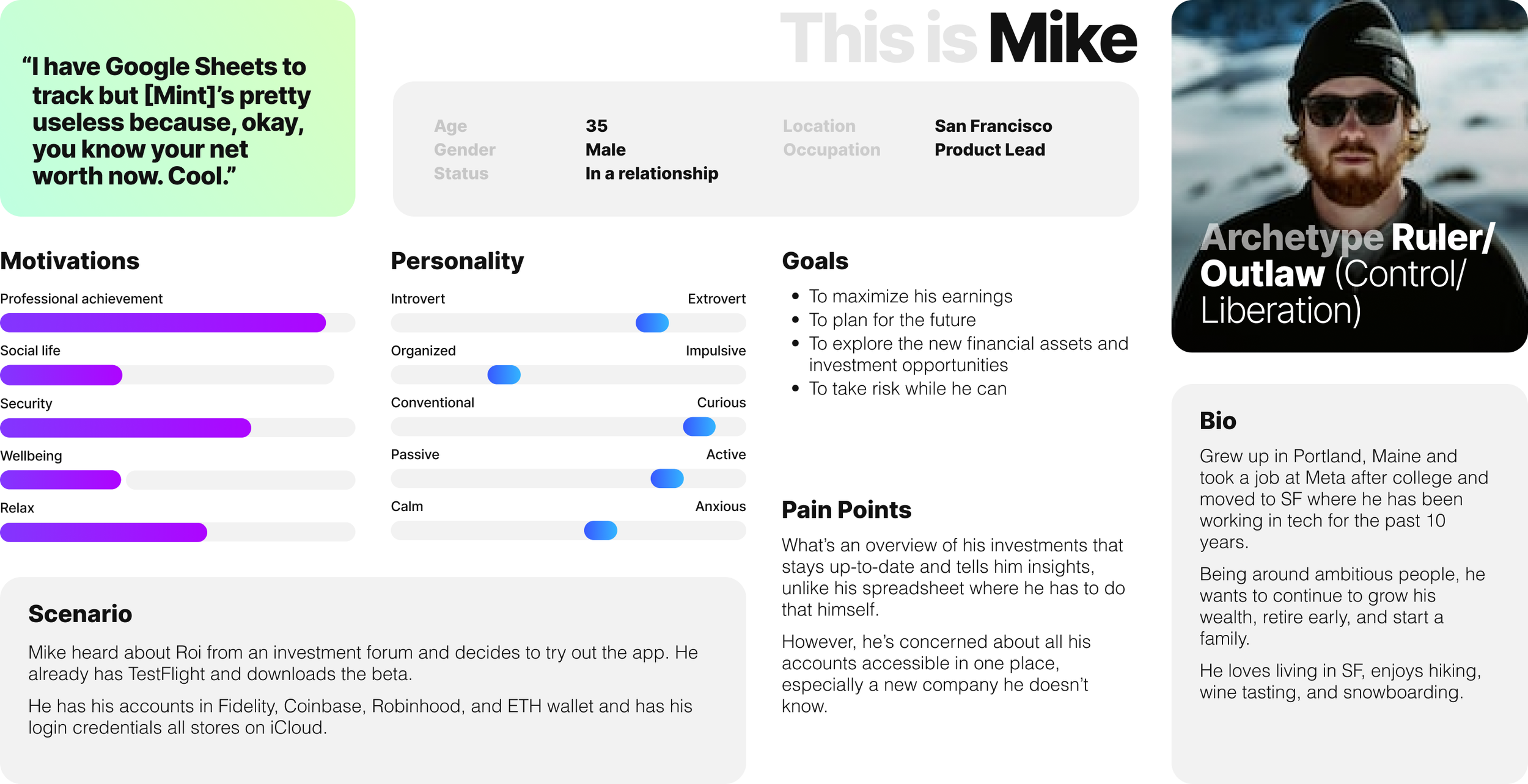
Mike is a product manager who isn’t taking full advantage of the opportunities to maximize his investments. He needs a way to access all his assets quickly and conveniently from a mobile device.
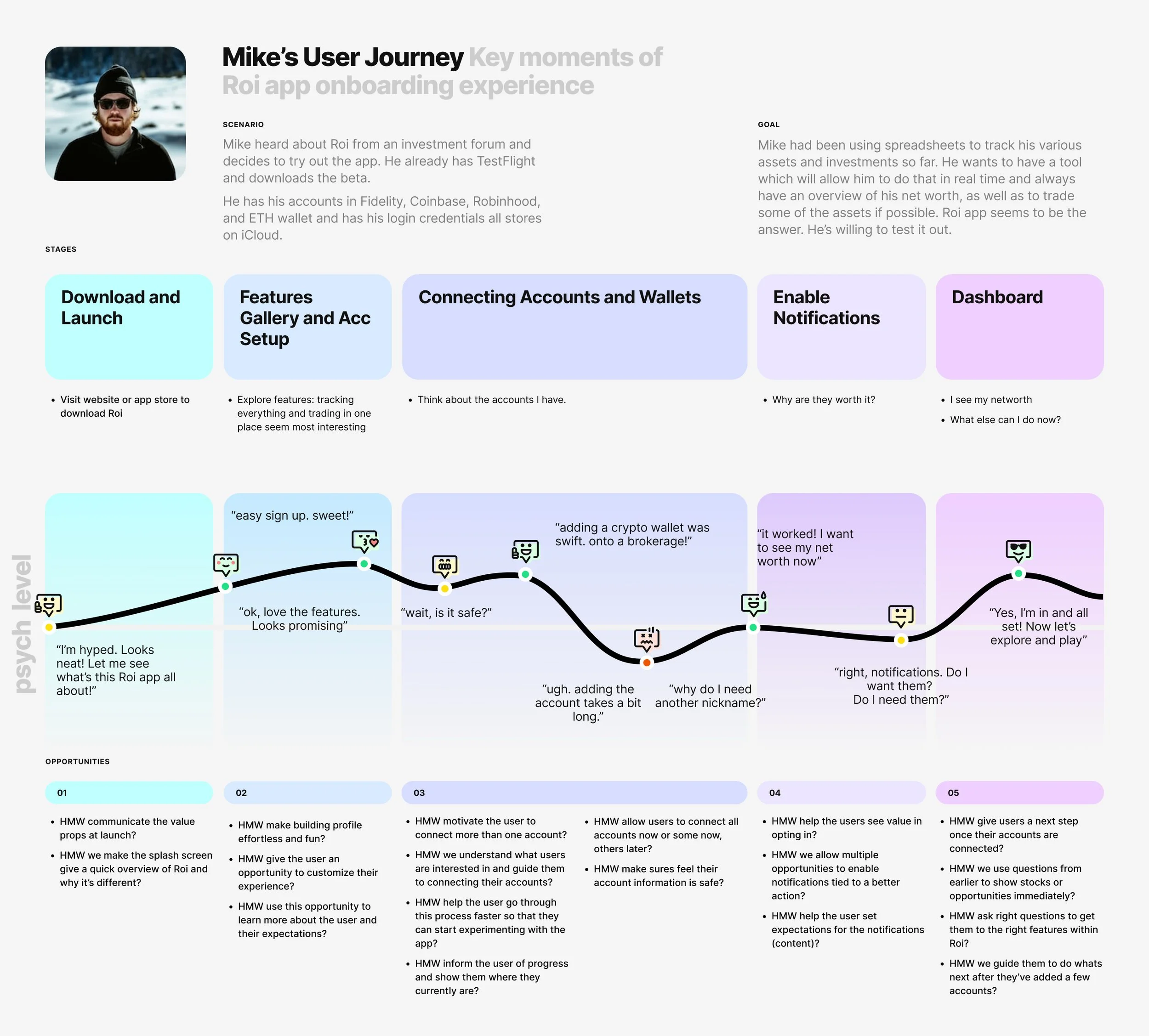
The user’s journey map allowed us to understand the onboarding experience of a portfolio management app.
Mike’s steps, obstacles, successes, and the accompanying feelings create a foundation for designing a delightful onboarding.
The Solution
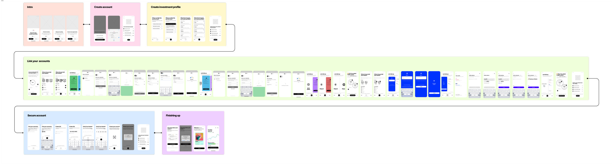
We combined all the best practices and the current user flow and broke it into sections. This helped us lay the foundation and determine our building blocks.
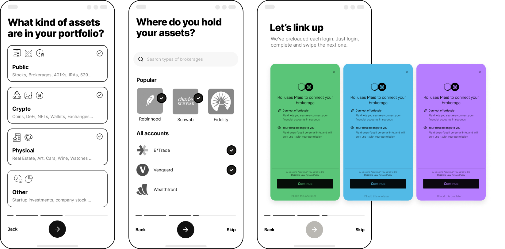
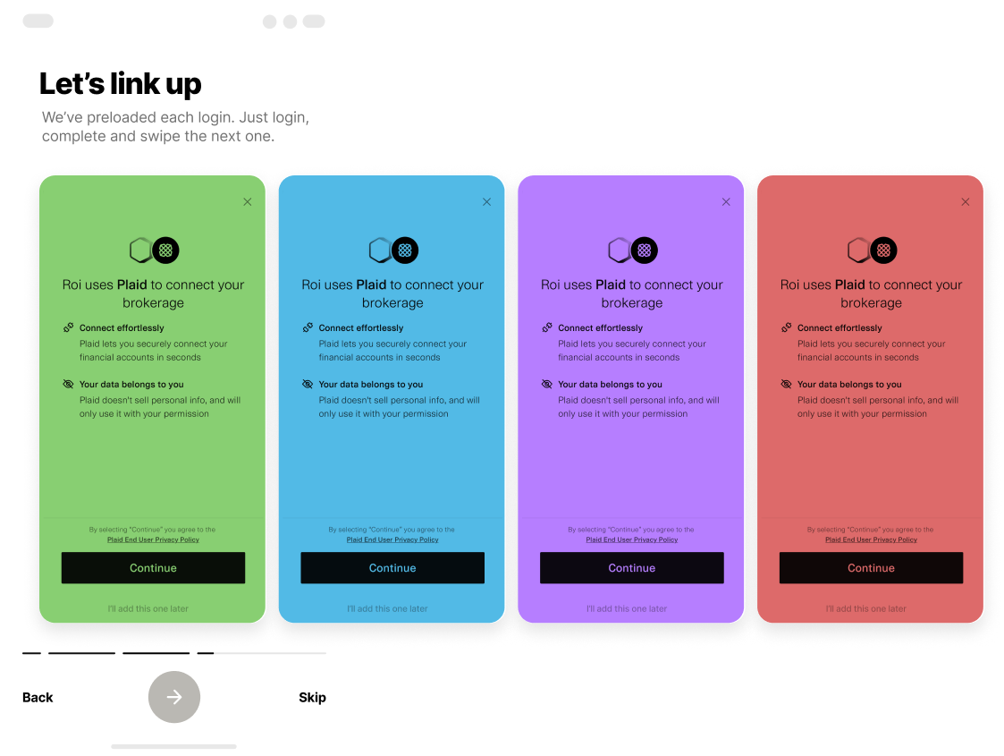
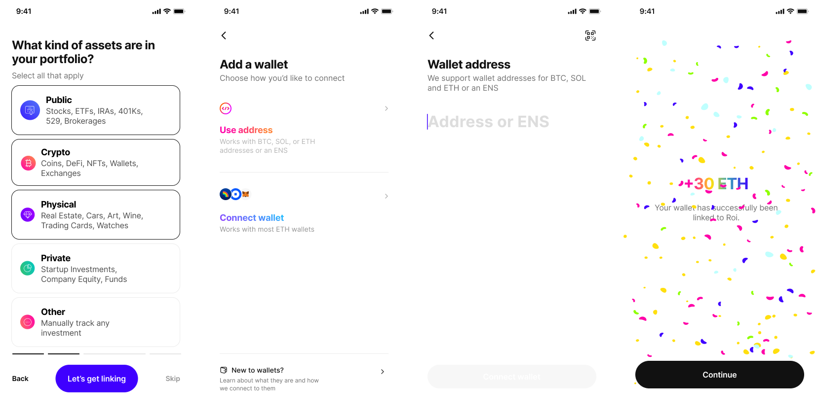
The linking account part of Roi’s onboarding flow is the key to its success. This is what we’ll focus on.
↓
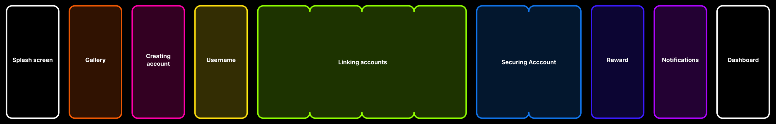
New user flow
the solution
02. Innovative
Then we went to how about we make it even easier and open all the logins in one view like you would an app switch on iOS and try to swipe through and log in one at a time, making it a fun thing to do.
01.1
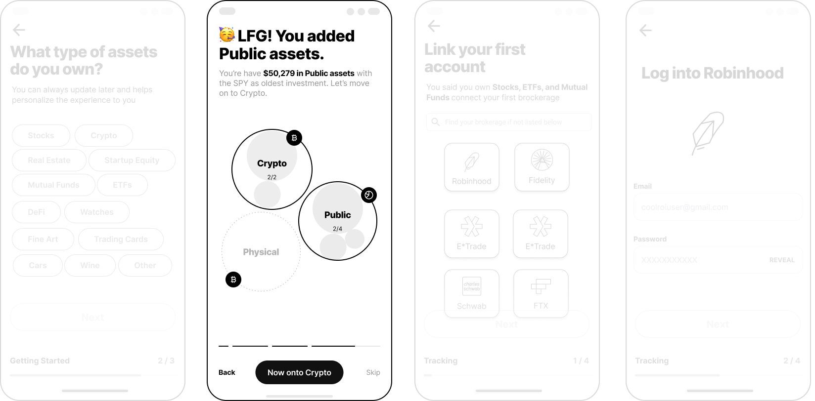
We can help them visualize it as a tree or a map and see if they can add stuff.
01. Logical
How about the user has all the options laid out, and they will be able to tap and add accounts?
We found ourselves at a crossroads.
Do we do this fun app-switching model?
Or do we do what’s practical and logical?
We iterated on the innovative model, tested the wireframe prototype with users, and…
it didn’t work :(
Technical limitations posed a major challenge to an exciting idea. Roi’s API partner Plaid had many restrictions, such as requiring the user to view the login screen each time. This made it difficult to complete the project in four weeks.
So we had to bail on this exciting idea and build another, more practical solution.
This is the Prototype